Mastering Alignment in UI Design: The Art of Simplifying Complexity
Alignment is a cornerstone of user interface (UI) design, often determining the difference between a clean, intuitive experience and a confusing one. At the same time, it may seem like a minor detail, but getting the alignment right is crucial for enhancing aesthetics and readability. However, using multiple alignments—such as centre, left, or right—within the same interface can create a cluttered and confusing user experience. Here’s how to navigate the complexities of alignment in UI design.
The Pitfalls of Mixed Alignments
When different types of alignments are used together, especially in small sections or components, the UI can appear disorganized and difficult to navigate. For example, imagine a layout where the title is centre-aligned, the body text is left-aligned, and the buttons are right-aligned. This mix can make it hard for the eyes to follow a logical path, increasing cognitive load and diminishing the user experience.
Example 1: The Confusion of Mixed Alignments
Consider an interface with a centre-aligned title, left-aligned body text, and buttons. This inconsistency can disorient the user, making the interface appear less tidy and increasing cognitive load.
The Power of Consistency
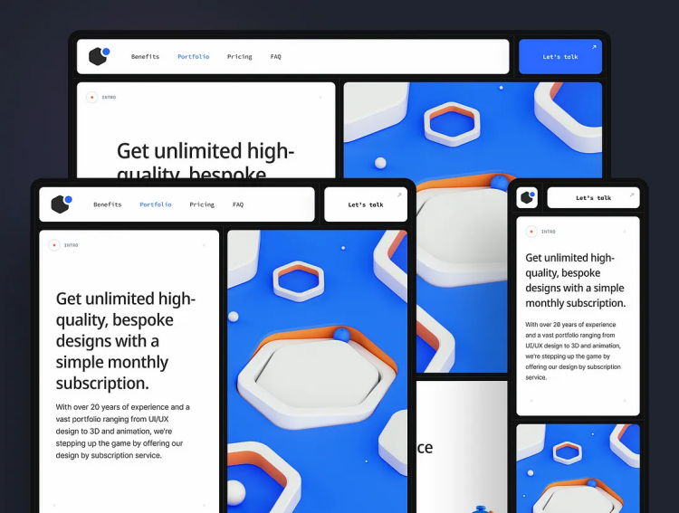
In contrast, sticking to a single alignment or using as few alignments as possible can simplify the UI, making it easier to navigate and more aesthetically pleasing. For instance, left-aligning most elements creates a clean, straight edge that guides the eye and improves readability.
Example 2: The Elegance of Simplified Alignments
Imagine a profile page where the person’s name and role are center-aligned, the photo is right-aligned, and the body text is left-aligned. This creates a zig-zag eye movement that can be jarring. A more effective approach would be to left-align most elements, creating a more cohesive and visually pleasing layout.
Exceptional Cases: When to Break the Rule
There are instances where using multiple alignments can be effective. For example, if the amount of text is minimal, center-aligning all elements can work well. However, in such cases, it’s advisable to make interactive elements like full-width buttons to accommodate left- and right-handed users.
Conclusion
Alignment is more than just a design detail; it’s a fundamental aspect that significantly impacts the user experience. By being mindful of how and when to use different alignments, designers can create interfaces that are not only visually appealing but also intuitive and user-friendly.